http://www.smurfhappens.com/site/
Save some of the promotional material with your attached research

Describe the film including the genre, the style of film, the actors, the storyline (include synopsis if you can find one)
Genre: Family comedy
Style of film: family fun movie for kids and also appeals to adults
Synopsis: When the evil wizard Gargamel chases the Smurfs out of their village, they’re forced through a portal, out of their world and into ours, landing in the middle of New York’s Central Park. Just three apples high and stuck in the Big Apple, the Smurfs must find a way back to their village before Gargamel tracks them down.
Cast and Crew:
Director - Raja Gosnell
Screenplay by - J. David Stem, David N. Weiss, Jay Scherick and David Ronn
Story by - J. David Stem, David N. Weiss
Cast - Neil Patrick Harris, Jayma Mays, Sofia Cergara and Hank Azaria
Voices
Anton Yelchin as Clumsy
Jonathan Winters as Papa
Katy Perry as Smurfette
Alan Cumming as Gutsy
Fred Armisen as Brainy
George Lopez as Grouchy
Separately discuss the overall feel developed for each films promotional materials (is it clean, crisp and bright or dark, moody and grungy etc)?
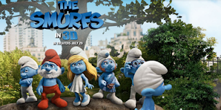
The overall feel for this movie is fun. The promotional materials are clean, crisp, a fun blue and bright colours. Also the contrasts in each smurf character and the colour hair or clothing they wear as it stands out against the others.The used of wide shots of New York as the backgrounds to the websites creates a contrast between the real world and the animation of the smurfs and intrigues you as to why they are mixed.
For the film reflect on how the website is laid out. (Look at the links, font and how the information or promotional materials are presented).
They have used movement in the website to make it fun and exciting with the characters falling and walking as you search around the site. The font used is big, bold, and groovy with letters falling as the smurfs walks past. The use of this movement and the way you control the smurfs and which way he walks creates and interest in the characters and helps to get a feel for the story.
Identify the Target Audience for each site (who are they? What age, interests, etc.) and discuss whether you feel the website is effective in appealing to this intended audience.
The target audience for the Smurfs movie is mostly young children but also adults too. This is because the movie is fun but is well known so appeals to a wide audience. The website has used this to create fun and cheeky moving characters and interactives while searching and looking around the site. The website is very effective in appealing to such a wide target audience all with different interests.
Talk about what you like/dislike about the promotional material for each film. Why?
I really like the contrast between the animation characters and real like settings used on the promotional posters, also the the different personalities captured in the posters of each Smurf character. The posters and advertising look more as though they are targeting a young children audience, although the movie appeals to a wide range this is because of the animation characters which doesn't appeal to me.
Find a Poster or Advertisement for the film, save the images in to your folder and insert here. In as much detail as possible discuss the following:
The colour scheme; cool, warm, analogous, complementary, sensitive, calming, exciting, vibrant, simple, etc. and how it makes you feel
The focal point: where do your eyes focus and why
Sense of Balance: Is the advertisement balanced in terms of line, tone, layout?
Harmony: Do all the advertisements elements (line, tone, colour, texture etc) work well together to create harmony or a sense of completion
Unity: which elements unite or make the advertisement effective eg. Use of a dominant colour scheme and high contrast to create unity
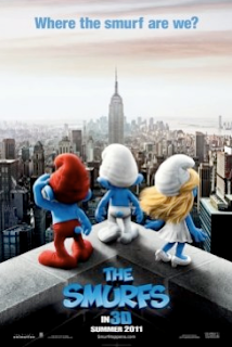
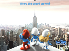
The colour scheme for this poster is vibrant characters with the dull New York setting in front. The focal point in this is the three smurfs with the Empire state building towering above and the colour contrasts between the red clothing, blond hair and white on the very blue characters. The advertisement is balanced with the main smurf in white with the building coming up and then the red and blond on wither side. The setting is dark and simple but is in contrast to the vibrant smurfs. The separate colours suggests the personalities of each character and the body language shows they are puzzled and intrigued as to where they are. The caption at the top says, “Where the smurf are we?” which supports this. The use of blue as the title colour and caption colour is very effective as it stands out and contrasts to the gloomy New York setting that fades in the distance to show the size scale of three little smurfs in a huge unknown city.
The Bourne Ultimatum
http://www.universalpictures.com/awards/bourneultimatum/
1. Save some of the promotional material with your attached research
2. Describe the film including the genre, the style of film, the actors, the storyline (include synopsis if you can find one)
Genre: Action
Synopsis:
Cast and Crew:
Director - Paul Greengrass
Screenplay by -Tony Gilroy
Story by -Robert Ludlum
Cast -
Matt Damon is Jason Bourne
Julia Stiles is Nicky Parsons
David Strathairn is Noah Vosen
Scott Glenn is Ezra Kramer
Paddy Considine is Simon Ross
Edgar Ramirez is Paz
Albert Finney is Dr. Albert Hirsch
Joan Allen is Pamela Landy
3. Separately discuss the overall feel developed for each films promotional materials (is it clean, crisp and bright or dark, moody and grungy etc)?
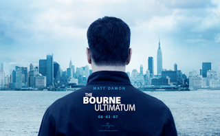
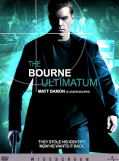
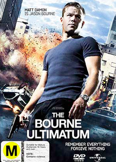
Because this film is an action film the promotional material is fast looking. The first poster is of the main character walking with a determined expression on his face. He is looking to the left as though he is check is someone is following. The poster is in black and white and the background is blurred to show the movie is fast paced. Their is a gun in his hand to show this movie may be violent and the dark clothing worn and blurred background shows he is trained and professional.
4. For the film reflect on how the website is laid out. (Look at the links, font and how the information or promotional materials are presented).
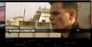
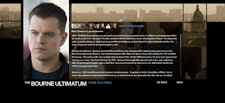
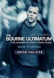
The website is very well set out. The music from the movie is playing in the background and when you pass your mouse over a link the letters swap to numbers which adds to the action of what he is running from. The font is ver professional and the website backgrounds are very dark with dark photos and black sides. The website is set out so their are a few photos per page as it is a prfile on a computer and the the main character is wanted.
5. Identify the Target Audience for each site (who are they? What age, interests, etc.) and discuss whether you feel the website is effective in appealing to this intended audience
The target audience for this sight I would say I mostly aimed at men over 15 who like fast pace action movies that are violent and involve guns. The website is very effective in appealing to this audience as it is set out very professional and dark.
6. Talk about what you like/dislike about the promotional material for the film. Why?
I really like the mystery behind the promotional material. I also really like the website as it is themed well.
7. Find a Poster or Advertisement for the film, save the images in to your folder and insert here. In as much detail as possible discuss the following:
The colour scheme; cool, warm, analogous, complementary, sensitive, calming, exciting, vibrant, simple, etc. and how it makes you feel
The focal point: where do your eyes focus and why
Sense of Balance: Is the advertisement balanced in terms of line, tone, layout?
Harmony: Do all the advertisements elements (line, tone, colour, texture etc) work well together to create harmony or a sense of completion
Unity: which elements unite or make the advertisement effective eg. Use of a dominant colour scheme and high contrast to create unity.
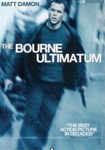
There are quite a few different promotional posters for The Bourne Ultimatum. All though are very similar. Each are almost black and white, very dak, intense. Below is the main poster. The poster colour scheme is as if you are looking at it through a special camera and the way his attention is diverted to the left suggests he is followed or wanted. The focal point is his face that is very intense you then see the gun in his hand. The way the background is blurred and his coat is blowing back makes it look as though he is running and the movie will be an action. The poster is balanced with the main characters name in the top left hand corner and a quote in the bottom left. The titile is angled to add to the fast paced action theme. The font and colours are simple while professional. The use of focus to blur the image is very effective in the poster. Even though cannot see the gun you can tell it is one. The background is blurred but you can see it is some sort fo street with a building and his attention is focused on the other side. This promotional poster leaves a lot of unanswered questions which leaves you wanting to see the movie.


