Friday, October 14, 2011

Adobe Photoshop

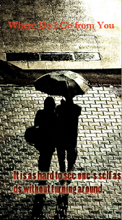
For the last two lessons we have been working on creating promotional posters on Adobe Photoshop. to do this we had to go to wikipeadea and a random page whould come up. the title of this would be the title of the movie for the poster. Then we had to go on a quotes website and the last quote was the quote for the poster. The we had to go on pictures and the thrid one was the backgrounf for the poster. below are some i have done so far.

This is my first try. i don't like the way this poster turned out. it was my first time using adobe photoshop and this poster was me getting the hang of it.


i was happy with the way my posters turned out, I now know how to use adobe photoshop. next lesson we will be starting on our own promotional film poster for our own website.

Research

  http://www.smurfhappens.com/site/

Save some of the promotional material with your attached research
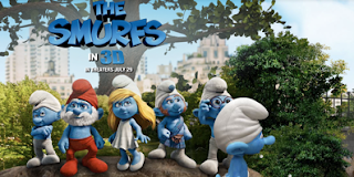


Describe the film including the genre, the style of film, the actors, the storyline (include synopsis if you can find one)

Genre: Family comedy
Style of film: family fun movie for kids and also appeals to adults
Synopsis: When the evil wizard Gargamel chases the Smurfs out of their village, they’re forced through a portal, out of their world and into ours, landing in the middle of New York’s Central Park. Just three apples high and stuck in the Big Apple, the Smurfs must find a way back to their village before Gargamel tracks them down.

Cast and Crew:
Director - Raja Gosnell
Screenplay by - J. David Stem, David N. Weiss, Jay Scherick and David Ronn
Story by - J. David Stem, David N. Weiss
Cast - Neil Patrick Harris, Jayma Mays, Sofia Cergara and Hank Azaria
Voices 
Anton Yelchin as Clumsy
Jonathan Winters as Papa
Katy Perry as Smurfette
Alan Cumming as Gutsy
Fred Armisen as Brainy
George Lopez as Grouchy


Separately discuss the overall feel developed for each films promotional materials (is it clean, crisp and bright or dark, moody and grungy etc)?
The overall feel for this movie is fun. The promotional materials are clean, crisp, a fun blue and bright colours. Also the contrasts in each smurf character and the colour hair or clothing they wear as it stands out against the others.The used of wide shots of New York as the backgrounds to the websites creates a contrast between the real world and the animation of the smurfs and intrigues you as to why they are mixed.


For the film reflect on how the website is laid out. (Look at the links, font and how the information or promotional materials are presented).
They have used movement in the website to make it fun and exciting with the characters falling and walking as you search around the site. The font used is big, bold, and groovy with letters falling as the smurfs walks past. The use of this movement and the way you control the smurfs and which way he walks creates and interest in the characters and  helps to get a feel for the story.

Identify the Target Audience for each site (who are they? What age, interests, etc.) and discuss whether you feel the website is effective in appealing to this intended audience.
The target audience for the Smurfs movie is mostly young children but also adults too. This is because the movie is fun but is well known so appeals to a wide audience. The website has used this to create fun and cheeky moving characters and interactives while searching and looking around the site. The website is very effective in appealing to such a wide target audience all with different interests.


Talk about what you like/dislike about the promotional material for each film. Why?
I really like the contrast between the animation characters and real like settings used on the promotional posters, also the the different personalities captured in the posters of each Smurf character. The posters and advertising look more as though they are targeting a young children audience, although the movie appeals to a wide range this is because of the animation characters which doesn't appeal to me.
Find a Poster or Advertisement for the film, save the images in to your folder and insert here. In as much detail as possible discuss the following:

The colour scheme; cool, warm, analogous, complementary, sensitive, calming, exciting, vibrant, simple, etc. and how it makes you feel
The  focal point: where do your eyes focus and why
Sense of Balance: Is the advertisement balanced in terms of line, tone, layout?
Harmony: Do all the advertisements elements (line, tone, colour, texture etc) work well together to create harmony or a sense of completion
Unity: which elements unite or make the advertisement effective eg.  Use of a dominant colour scheme and high contrast to create unity
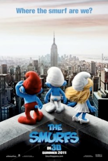
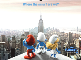
The colour scheme for this poster is vibrant characters with the dull New York setting in front.  The focal point in this is the three smurfs with the Empire state building towering above and the colour contrasts between the red clothing, blond hair and white on the very blue characters. The advertisement is balanced with the main smurf in white with the building coming up and then the red and blond on wither side. The setting is dark and simple but is in contrast to the vibrant smurfs. The separate colours suggests the personalities of each character and the body language shows they are puzzled and intrigued as to where they are. The caption at the top says, “Where the smurf are we?” which supports this. The use of blue as the title colour and caption colour is very effective as it stands out and contrasts to the gloomy New York setting that fades in the distance to show the size scale of three little smurfs in a huge unknown city.


The Bourne Ultimatum
http://www.universalpictures.com/awards/bourneultimatum/

1. Save some of the promotional material with your attached research


2. Describe the film including the genre, the style of film, the actors, the storyline (include synopsis if you can find one)

Genre: Action
Synopsis:

Cast and Crew:
Director - Paul Greengrass
Screenplay by -Tony Gilroy
Story by -Robert Ludlum
Cast -
Matt Damon is Jason Bourne
Julia Stiles is Nicky Parsons
David Strathairn is Noah Vosen
Scott Glenn is Ezra Kramer
Paddy Considine is Simon Ross
Edgar Ramirez is Paz
Albert Finney is Dr. Albert Hirsch
Joan Allen is Pamela Landy

3. Separately discuss the overall feel developed for each films promotional materials (is it clean, crisp and bright or dark, moody and grungy etc)?
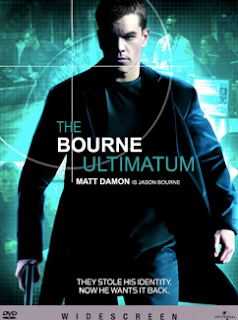
Because this film is an action film the promotional material is fast looking. The first poster is of the main character walking with a determined expression on his face. He is looking to the left as though he is check is someone is following. The poster is in black and white and the background is blurred to show the movie is fast paced. Their is a gun in his hand to show this movie may be violent and the dark clothing worn and blurred background shows he is trained and professional.

4. For the film reflect on how the website is laid out. (Look at the links, font and how the information or promotional materials are presented).
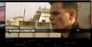
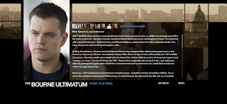
The website is very well set out. The music from the movie is playing in the background and when you pass your mouse over a link the letters swap to numbers which adds to the action of what he is running from. The font is ver professional and the website backgrounds are very dark with dark photos and black sides. The website is set out so their are a few photos per page as it is a prfile on a computer and the the main character is wanted.

5. Identify the Target Audience for each site (who are they? What age, interests, etc.) and discuss whether you feel the website is effective in appealing to this intended audience
The target audience for this sight I would say I mostly aimed at men over 15 who like fast pace action movies that are violent and involve guns. The website is very effective in appealing to this audience as it is set out very professional and dark.

6. Talk about what you like/dislike about the promotional material for the film. Why?
I really like the mystery behind the promotional material. I also really like the website as it is themed well.
 
7. Find a Poster or Advertisement for the film, save the images in to your folder and insert here. In as much detail as possible discuss the following:

The colour scheme; cool, warm, analogous, complementary, sensitive, calming, exciting, vibrant, simple, etc. and how it makes you feel
The focal point: where do your eyes focus and why
Sense of Balance: Is the advertisement balanced in terms of line, tone, layout?
Harmony: Do all the advertisements elements (line, tone, colour, texture etc) work well together to create harmony or a sense of completion
Unity: which elements unite or make the advertisement effective eg.  Use of a dominant colour scheme and high contrast to create unity. 
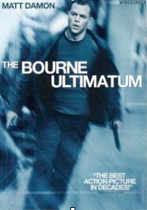


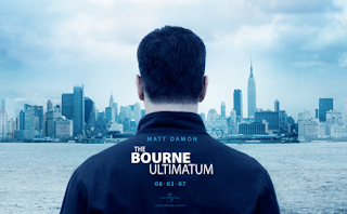
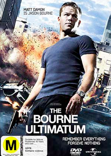
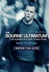
There are quite a few different promotional posters for The Bourne Ultimatum. All though are very similar. Each are almost black and white, very dak, intense. Below is the main poster. The poster colour scheme is as if you are looking at it through a special camera and the way his attention is diverted to the left suggests he is followed or wanted. The focal point is his face that is very intense you then see the gun in his hand. The way the background is blurred and his coat is blowing back makes it look as though he is running and the movie will be an action. The poster is balanced with the main characters name in the top left hand corner and a quote in the bottom left. The titile is angled to add to the fast paced action theme. The font and colours are simple while professional. The use of focus to blur the image is very effective in the poster. Even though cannot see the gun you can tell it is one. The background is blurred but you can see it is some sort fo street with a building and his attention is focused on the other side. This promotional poster leaves a lot of unanswered questions which leaves you wanting to see the movie.
Thursday, October 6, 2011

Terms I need to know for revision test

Elements of film: sound, lighting, setting

Mise en scene: sound, lighting, setting, props, acting

Cinematography: contrast, exposure

Editing:rhythm: beat of film, passing of time: rate at which film operates, graphic relationships: cut, fade........ break in the film where one shot ends and the next shot begins

Genre: comedy, action, romance, horror, drama


Camera Angles: use of different camera angles and shots to show a scene


Lighting: use of colours and exposure to create a mood

Post Production: after shooting of film

Pre-production:Plans are put into place including scripting, scene break down, storyboard, shot list, casting, location, equipment hire, catering, transport, informing people

Production: filming of script

EDL (Editing decision list): list of choices made of filters and efects when editing the film

Video transitions: cuts, fade, dissolve, wipes edited into the movie


Rendering: in editing footage computer is setting changes and choices into piece of footage

Tuesday, August 9, 2011

Final Reflection on Film

 After handing in our rough edits done on either i-movie or final cut pro, we had to answer the following questions as a final reflection on the film process.

Reflection for Production Task
Respond to each of the following points (using complete sentences or paragraphs). You should include as much detail as possible in your responses.


1.   Describe any problems or difficulties your group encountered during the planning. These may include; organizational problems, group related issues, etc.
In the organisation process I was with Petra in coming up with ideas. We were well organised but it was hard as we had so many different ideas and separate concepts of what we wanted our horror movie to be. Our storyline continued to change each lesson and we had more and more new ideas we wanted to add and in the end we had to cut it down as it became to complicated. As Petra went on exchange, Lauren and Daisy accepted me into their group which worked really well, and I am really happy with the way everything worked out.

2.   Clarify any time-management issues your group encountered during the planning process and describe the steps you implemented to improve in this area;

Before Petra went on exchange we were really rushing to film, but we knew we were weeks away from being ready. Because of this when she left I swapped groups. With Lauren and Daisy we had no time management problems. We were very organised and has all of the preparation done with time to spare. We filmed in the holidays and so have had nearly 4 weeks to edit which has been plenty of time.

3.   Discuss whether your group made effective use of the provided templates to assist the film-making process;
We did the preparation sheets together and that worked well. In the filming we did use the film breakdown and props list effectively and without it we would have been very lost and unorganised. Although we used it, we did not stick to the specific shot types we planned on. This was because when we filmed we saw more opportunities for good filming. We also effectively used the film schedule so we were on track with filming as we had limited time. This really helped as it took much longer to film than we originally though it would.

4.   Explain whether the planning process helped your group during filming. In particular, discuss whether the use of devices such as storyboards, shot-lists, and rough edits assisted throughout the filming process;
The planning process definitely helped us in the filming process. Most importantly the film breakdown. This was the main template we used as a guide in our filing. As I wasn’t in the group for the storyboarding process, I only saw the storyboards finished but our final footage was different form the storyboards. They were good to get an overall feel of what the film will eventually look like and they did help in making the film breakdown but in the actual filming process we didn’t refer to them much. Rough edits we practiced helped also a it helped to get a feel for what you need to do and what looks good.

5.   Describe any problems or difficulties your group encountered during the filming process. These may include; organization problems, unreliable cast members, group related issues, equipment problems, etc.
Our group worked well together. We were all very organised and knew not to make it too complicated or unrealistic. Our cast was small with only Serena, Daisy sister who was lots of fun and really good when we were filming. She also helped with the props used which were unplanned but amazing.


 6.  After reviewing your footage and completing the rough cut of your film, describe any aspects of your film, which need to be addressed. i.e does your group need to reshoot any scenes; are any additional shots required; are there any scenes which worked better than expected.
The dress up scene originally was meant to be a picnic scene and we changed this when filming as Serena had amazing props to use. This scene turned out much better than expected with the sunlight coming through the blinds. Some of the night time scenes were shot in the morning with the blinds closed and they don’t looks as believable as I would have liked. Also the camera in some scenes is either shaky or is really pixelated and fuzzy especially in the beginning shot of Mr Binx. A few of the night time scenes got muddled with some of them with New Teddy in the dress when she shouldn’t have been as dress up was the next day! Overall our footage was really good, but if we were to do it again we would change a few aspects.

 7  List any skills, techniques or tricks you have discovered during the project.
I have learned many new techniques in the making and process of the film. One trick we learned was instead or our original plan to cut New Teddy’s neck and pull out the stuffing we used stiffing from one of the ruined toys under the bed and placed it around the neck to make it look like the neck was cut when it really wasn’t.

8.   Discuss whether you undertook adequate and detailed reflection to throughout your project. Have you provided enough evidence to support your work? (Look back at your blogs/journals and think about whether it looks like 6 weeks worth of work).

When looking back at older posts I have done ok reflections throughout the process. I do have the shooting schedule and practice edits up as well as a practice video done on i-movie earlier on. I think toward the end and the start of this term I have not done much reflection because I have been busy editing, which has taken much longer than expected. I think I needed to keep up the blog posts even after filming, which I haven’t done as well as I should have.

 Discuss your feelings about the production task:

9.   Are you satisfied with your groups final result?

I am really happy with our final result. Although it may not be terrifyingly scary it is still a scary movie, and once edited more will get better.

10.   Would like to change any aspects of your film?
No, I wouldn't. I am really happy with the footage and way the film turned out.

11.   If you could start the project again what would you do differently?
I would retake some of the nighttime scenes again to make them look more realistic as even edited with the brightness changed they dont look quite as good as they should be. I would also be more careful in muddling up the scenes with what each character is wearing, as it can make the days and editing very hard. I would also use a tripod to get still footage so it isn’t shaky and use a video camera, or change the quality so it is higher to avoid the image being pixelated.

Thursday, July 14, 2011

i-movie

Today in class we started editing our videos. i did the title and cut the first scene of ours.
below are some of the i-movie shortcuts to help us in editing our film and speeding up the process.

IMOVIE SHORT CUTS

SPACE BAR: PLAY VIDEO AND STOP
COMMAND T CUTS VIDEO
COMMAND E EXPORT MOVIE
COMMAND G PLAY FULL SCREEN
LEFT ARROW OR RIGHT ARROW PLAY MOVIE FRAME BY FRAME
HOLD DOWN CONTROL KEY FREEZE THE PLAYHEAD
COMMAND N CREATE NEW PROJECT
COMMAND C COPY SELECTED FRAMES
COMMAND X CUT SELECTED FRAMES
COMMAND V PASTE SELECTED FRAMES
I OPEN CLIP ADJUSTMENTS PANE OF INSPECTOR
COMMAND Z UNDO LAST WORK

Monday, July 11, 2011

Film Language

Elements used to elict an emotional response in the audience:

Cinematography
Mise en scene
Sound

Editing: 
rhythm: beat of film
passing of time: rate at which film operates
graphic relationships: cut, fade.......


What makes a good edit?
- The beat of the music was in time with the cuts in the film
- Music creates the impact and makes the film powerful
- Colour scheme/temperature of lighting has huge impact and emotional significance
- Choice of sound sets the mood but also works to tell and enhance the storyline
- Types of edit that create impact includes, dissolves, cross dissolves, fade in, fade out, fade to black, fade to white, wash in, wash out
- Graphics: editing images; crop footage, overlay footage and fade it through layer, cutting out backgrounds ad replacing them with other layers (chroma keying), adjust the colours, layer photos on top of footage

i-movie
-command t; splits footage

Thursday, June 2, 2011

Props list

Today in class we worked on a props list. this is a list of what we will need for each scene so we have everything ready when it is time to shoot the film. For ours we have divided it up into 3 acts. the introduction, middle and conclusion. Each act involves different props and we will need to have all of them for the film to work.
 
Creative Media blog - Blogger Templates, Wordpress Templates Free - by Templates para novo blogger HD TV Watch Entourage Online. Featured on Local Business Singapore